· 5 min read · Design systems, Process
Multibrand design systems with AI, part 2: structure, components and variables
When you start doing a big multibrand design system you might be drawn into trying to tokenize everything, thinking it will give you more room for customization later. Remove that thought from your head. It will destroy you. Even simple components might have hundreds of tokens that will need to connect somewhere. Here is a small structure: how to organize files, pages, components, and how to set up variables without getting lost in naming.
This is part 2. In part 1 I ask whether you need this at all and which tool to use. Part 3 is about AI and code.
Start small, on purpose
Multibrand design systems can get very big very fast. If you want to customize every aspect and do it big, you will have a bad time. What I do so I don't drown:
- Two brands first. With one brand you don't learn anything about the differences. And if you start with three or more before you have a core, you're guessing.
- Audit before building. List what both brands actually use today: colors, type, radii, components and so on. Build only what appears in both.
- Decide on the naming. Strangely, this can become a problem when you are assigning values. Don't stress, you can refactor later.
- Rule of three. Keep a value inside one component until several components need it.
- Don't tokenize everything. Even Adobe Spectrum says component-specific tokens (like a tooltip's maximum width) play a much smaller role than the reusable semantic ones. So make few of them.
Files and pages
You need two kinds of files:
- Core library (variables, text and effect styles, all components)
- Brand files (one per brand)
Pages inside the core file:
- Cover (name, status, owner, version)
- Foundations (color, type, spacing, radius, shadow, icons and so on)
- Components (one section per component, all variants)
- Patterns (forms, empty states; add later)
- Flows
- Playground (scratch space, never published)
This way foundations are the attributes that define components, which get built into patterns, which become the app. It's more or less Brad Frost's atomic design (atoms, molecules, organisms), but you don't need to name your pages after it. If you find you need a lot more pages than this, you're probably writing documentation instead of building.
The first components
Build, in this order: text and heading styles, buttons, inputs, navigation, cards, alerts, modal, table.
If only one brand uses something, leave it out until the second brand needs it too.
Variables: three layers
Three layers for Figma variables. Tokens Studio uses a multidimensional system, which is superior in every way.
| Layer | Also called | Example | Brand-specific? |
|---|---|---|---|
| Primitive | Reference, global | blue-600 = #1D4ED8 |
Yes, the values |
| Semantic | System, alias | color.action.primary → blue-600 |
The mapping |
| Component | Component-level | button.background → color.action.primary |
Rarely |
Tokens Studio (or working with design tokens) uses multi-dimensional theming. That means you can make many layers. The one I use is described in the image below.
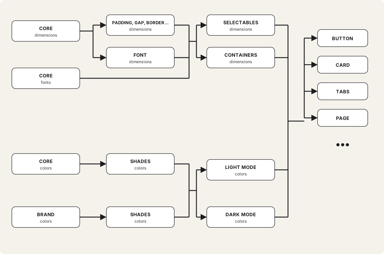
You have your first layer of primitives on the left. Primitive color shades get automatically calculated, then assigned to light or dark mode, and then those get assigned to components. Primitive dimensions get assigned t-shirt sizes for different types. Those get assigned to either selectables (interactive elements such as buttons, inputs and so on) or containers (cards, sections, background elements). These then get assigned to the final components.
Why like that?
It's because this is the smallest system I found with which you can easily make drastic changes to the design. For colors, you can change the primitives, change shades only if you don't like the calculated values, and change light/dark mode only if you need to. For dimensions you can change padding all around the site, or just for selectables, or just for containers. And you can still change any particular value assigned to any component individually. And since Tokens Studio has multidimensional themes, you can create a new design just by overriding a value on any of these layers. It's brilliant. It would be even more brilliant if Tokens Studio wasn't so complicated to understand.
You don't always need all of that. Primer gets by with two tiers, base and functional. So two layers can be enough if the branding objective is very simple, like software where you only need to change a few basics.
Modes. In Figma, one mode is one set of values. Brand and light/dark are two different things, so keep them apart.
Density (compact, comfortable) is just another mode on spacing. Skip that if you can. I wouldn't do that with Figma variables, but it's quite simple with Tokens Studio.
Naming. Pick one pattern and stick with it, for example category.property.role.state, so color.text.secondary or color.border.error. Use only the levels you need, and name things by what they're for, not how they look (action, not blue).
How many? Not the right question. You will need many shades of colors. Figma variables need a variable for each, so the number of tokens goes up. I'd say around 100 semantic tokens is about as much as I'd want to have. For Tokens Studio it's harder to say. You might have way fewer.
Brand differences: token or variant? Don't try to make each component incredibly customizable so you can adapt its style in many different ways. It's better to build several variants (though developers won't like it).
Will AI build you this system?
No. It won't. There are not enough examples of how it should be set up for it to just build everything. You have to be there and hold its hand, and when you finally build it, you won't know what it is and how it works. Inevitably, you will have to bite the bullet, tear into it and understand it.
Sources
- Atomic Design, chapter 2 - Brad Frost: atoms, molecules, organisms
- Spectrum design tokens - global, alias, component-specific tokens
- Primer primitives - base and functional tiers, color modes and themes
- Guide to variables in Figma - modes, light and dark
- Tokens Studio docs - Figma plugin, themes, DTCG setting
Comments